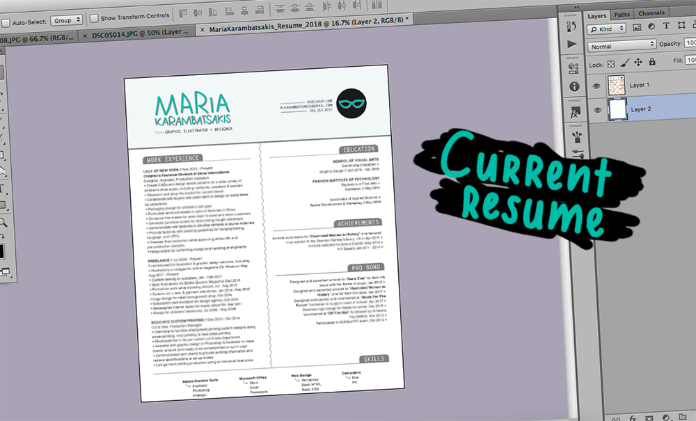
Mostly after high school comes the task of putting yourself under a serious light by gathering your professional life and putting it on paper. It’s kinda stressful in the beginning when it feels like you don’t have much to share, but let me tell you, it continues to be stressful. I can’t tell you how many iterations of my resume I’ve had. Starting off in a word document, overdoing it in illustrator, trying to tone down but having to increase the font size to make it seem like a full page of experience, and then being told that it’s too busy and bright. Just like, ups and downs and revisions and color and no colors and minimal colors and adding more and subtracting unnecessary info, etc. I’ve been through all the changes, and I guess writing it down in list form is something I want to do to share what I’ve experimented with and what I’ve learned.
The overall look of your resume shouldn’t be overwhelming. Make sure there’s an equal amount of white space and text to give the eye a break. Create very concise sections to keep it organized. Basically it should be easy to read and easy to view without making your eyes pulsate in circles.

I’ve learned that the hard way. I think it’s easy to go overboard, especially as an artist. Your branding colors are okay. Keep the majority black and white, especially the body and the text. Accent colors are okay, and I totally vote for grey tones. I think it’s fun to jazz up your resume. Just keep it deliciously tasteful and once again – simple and shmeasy to read.
Use specific keywords for each section, especially under your job experience. If you’ve looked at as many job postings as I have, it’s pretty clear the constant repetitive words that are used by those seeking new employees. Take advantage by holding those dear keywords in your palm and toss them out smartly into your experiences.
That’s where the majority of the attention will go, so don’t be afraid to list off all your daily duties. If you’re comfortable asking your coworkers, see what else they would list off because sometimes you could overlook a task you don’t deem important.
The space on your resume should be used wisely. And let’s be honest, you’ll be explaining yourself in the cover letter. They both have their purpose, and the cover letter doesn’t need to repeat that information on your resume. If anything, share keywords that describe your talent under your name – just like a title. Here’s your chance to label yourself in a way that is okay!

Yup. You may have to create different resumes if you’re applying to different jobs. Sometimes a graphic design resume won’t fit a web design position if that’s what you’re applying for. You just need to be prepared to make different resumes if you’re playing the field. #nocommitments
I don’t know if this is obvious but it’s the safest file type as opposed to a document file or .jpg. (that makes me shudder).
I’ve always been taught that making a two page resume is too much, but sometimes its necessary. I personally try to fit everything onto one page, but there’s a point in your life where you have enough experience to share on two pages. When you’re young and you’re still gaining experience, obviously one page is the norm. But letting your resume flow to two pages – within reason – is okay. More than that is e-x-c-e-s-s-i-v-e.
If you know InDesign or Illustrator, go ahead and use those. As long as you save it as an interactive PDF, it’s all good. When filling out an application online where you’re asked to upload your resume, you want your file to be a kind of file where the sections are auto filled. That won’t happen with .jpgs or .pngs or other file types. That’s another reason why PDFs are the bees knees.
I’ve tried different styles of resumes and found that keeping it basic, professional, easy to read, laid out simple is the best way to do. Don’t opt for groovy, funny, silly, whacky, absurd, or anything else you can think of. Keep it professional. That’s what people want at the end of the day – to know if you’re capable of being professional, otherwise your resume may be turned down or thrown out. There are different ways to show off your personality – it may be safest to save that for the second month of working in a new environment though.

Bonus suggestion: Don’t be afraid to have friends, family, colleagues, professors, neighbors, or your parrots review your resume. Everyone’s experience looks different and it’s always helpful to see how others react to what you’ve put together through their perspectives. As annoying it is to constantly change or revamp, you’re only doing yourself a favor by checking yourself before you have a chance to wreck yourself. A.K.A. be unemployed forever.

★ Follow on Instagram @oddballera ✚ on Bloglovin' to keep up with this blog ★


